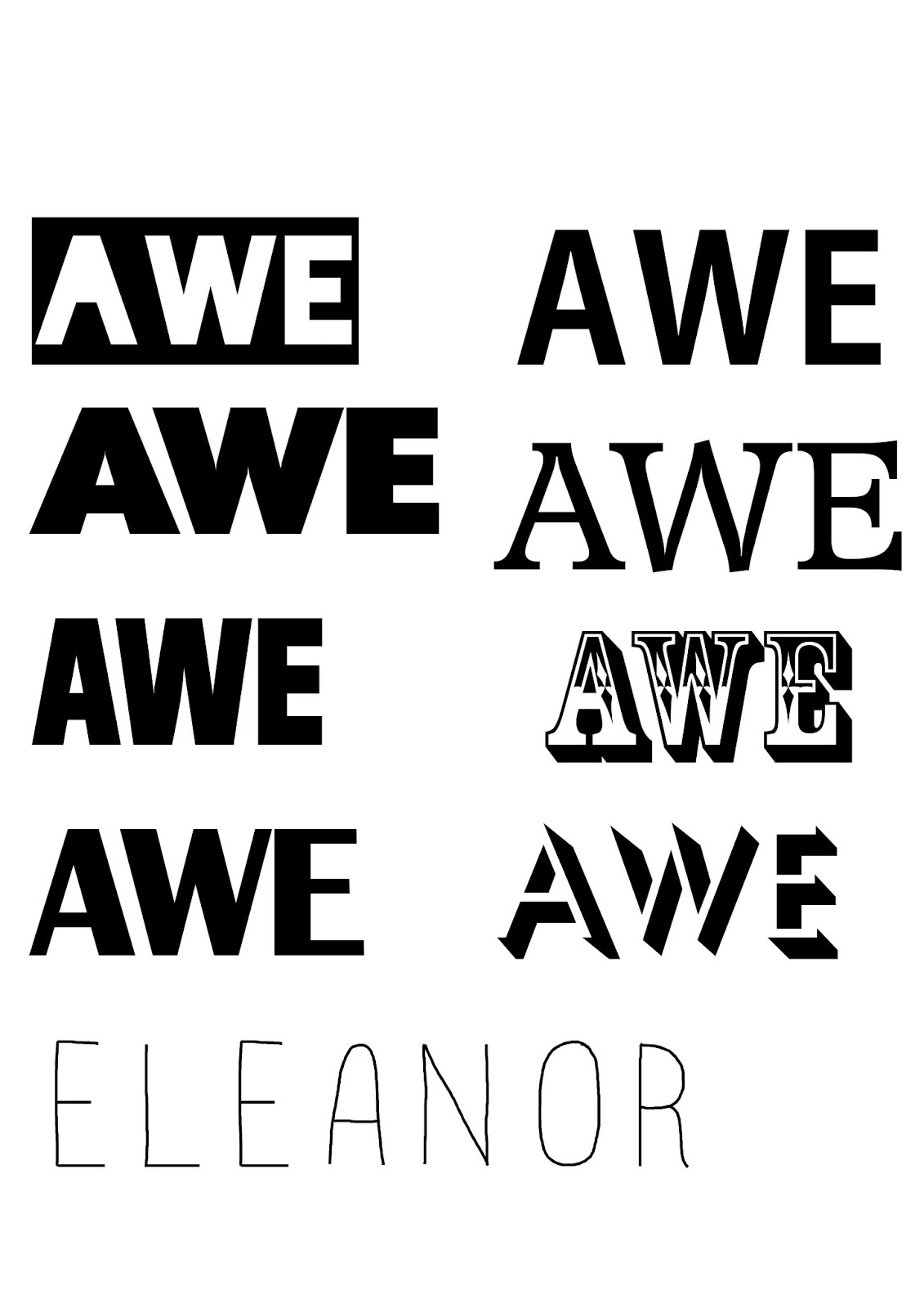
I have looked at seven more fonts for my magazines title. I have been trying to focus on simpler, bolder fonts as this makes the title stand out much more.
I am thinking of changing the cover picture to one with a white background as this will make it more easy to match a suitable font with it.

No comments:
Post a Comment