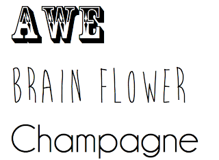
I think for my title 'AWE', this font fits the folk genre of the magazine, yet I am still undecided as it may look too circus-like and will not be taken seriously.
I like the handwritten font, and the idea that the artist had written it themselves, yet it may not suit the folk-ish genre very well.
This font 'Champagne' will suit the article, as it is quite artistic a bit more interesting than some of the other fonts I have look at.
 After placing the fonts onto my draft cover, double page spread and contents, i've realised that some fit with the page and some may need editing. I really like the font that I am using for the title of the magazine, yet at the top it starts to blend into the background of my picture. This may mean that it's not as legible and does not stand out like a title should.
 For the Artist's name i've used VTS chalk 79. I like this font as it is square but it has an artistic element to it. But like the previous font, it blends into the background around the artist's shirt. I think I could solve this by making this font a more greyish colour. This font does look better in colour against a white background. This is probably because you can partially see through it.
 For the extra text on the cover page, I wanted to use a simple font. I've chosen to use the Champagne font, but it's very thin and again blends into the background.
I think I may have to re-think the use of white text on parts of the cover to make the text more readable and make the magazine
title stand out more.
 After placing the fonts onto my draft cover, double page spread and contents, i've realised that some fit with the page and some may need editing. I really like the font that I am using for the title of the magazine, yet at the top it starts to blend into the background of my picture. This may mean that it's not as legible and does not stand out like a title should.
 For the Artist's name i've used VTS chalk 79. I like this font as it is square but it has an artistic element to it. But like the previous font, it blends into the background around the artist's shirt. I think I could solve this by making this font a more greyish colour. This font does look better in colour against a white background. This is probably because you can partially see through it.
 For the extra text on the cover page, I wanted to use a simple font. I've chosen to use the Champagne font, but it's very thin and again blends into the background.
I think I may have to re-think the use of white text on parts of the cover to make the text more readable and make the magazine
title stand out more.


Nice choices. You'll need to play around with them a bit and place them on the page to see what works and what doesn't.
ReplyDelete