Tuesday 26 February 2013

Cover Picture


After making my draft, I think I am going to shoot more photos with the model looking at the camera, but with a similar natural pose. 

Also, after researching more covers, I am debating whether to use an image with a more simple background e.g just plain white, so the text can stand out a lot more, or with a close up shot, focusing on just the model's face. I also think that this may make the magazine look more professional and conventional. I think using an image that is just the models face is very effective as the model is the first aspect that catches the readers eye.

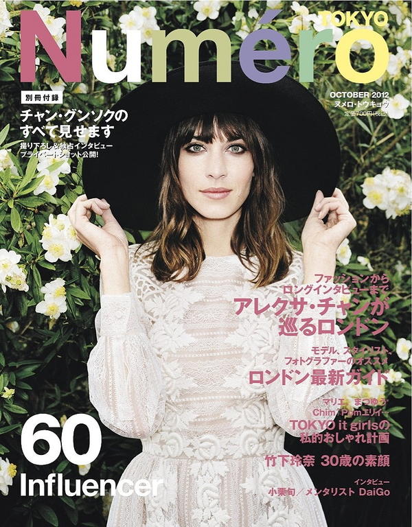
This is an example of another outdoor mid-shot. I think having the model closer to the background is more effective than having the model closer, meaning the background is out of focus.

Yet, I think that I will shoot some more pictures against a white background in a studio, as this will make the cover look much more professoinal as I feel that I will not be able to produce an outdoor mid-shot that will be of a good quality. This is because of the weather, as at the moment there is not enough green for the background to look natural, and the lighting will not be as effective if the weather is overcast.

Monday 25 February 2013

Checklist for Improvements

Cover:

  • Look at different fonts for masthead
  • Re-Take photos with model looking at camera
  • Change feature heading 
  • Add Price and Issue number to barcode
Contents
  • Correct spelling mistake
  • Look at other magazine layouts for inspiration
  • Add more text to show whats in the magazine
  • Page Number
Double Page Spread
  • Add a margin to ensure that no text is cropped
  • Change article title
  • Re-think quote boxes
  • Read other articles to make mine more interesting

Self-Review 1st Draft


Cover 
What I think went well:
  • I think the image I've chosen to use does not look too posed. This suits the genre of the magazine as it's very natural.
  • I like my magazine's title, most of the feedback I've received  has been positive about the name.
Better If:
  • I think the model should be looking at the camera, with the a similar natural pose.
  • I need to consider the colour scheme, as the white text is does not stand out against the background. 
  • I think I need to think about the font of the masthead. I've recived some criticism about whether the font fits the magazines genre and if it stands out enough.

Contents

What I think went well:
  • I like the image on this page, it shows a full shot of the model with the natural looking background.
  • I think the font I've used is very clear. 
Better If:
  • Personally, I do not like the layout I've used on this page. I think I need far more text and images, and I think i might need to consider using a white background to add variety to my images.
  • I need to check my spelling, as I've realized that I've made some spelling errors. 


Double Page Spread

What I think went well:
  • I like the text i've used for the artist's name. I think it looks different and stands out in comparison to different fonts i've used already.
  • I think how I've used colours from the picture on the text is quite effective. 
Better If:
  • I think I may need to change the image I've used. I think i'm going to use a guitar as a prop, because at the moment, you can't tell that she's a musician from first glance. I think the title of the page 'Ready for 2013' doesn't fit very well.
  • I think the use of two Eleanor's does not look right. I think i should have just included the main text on the left page. 


Tuesday 19 February 2013

Magazine Genre

I think another good representation of the genre and type if music I want to represent is shown through these YouTube video's by a blog called The Mahogany Sessions: 


www.youtube.com/themahoganysessions

Magazine Playlist

Tuesday 5 February 2013

Draft Article

Usually when you see a teenage girl with an acoustic guitar you tend to think of her writing songs about her silly heartbreaks, or how she's 'never, ever getting back together'. Yet, Eleanor is the complete opposite of this. Her songwriting is of a woman who has seen her time, her guitar playing is complex yet effortless and you'd never expect such a powerful voice to come out of such a small young woman. 

A: So 2012 was a crazy year for you, do you feel much has changed?
E: Oh god, last year was one of the best years of my life, so much has changed. After I signed the record deal, i've not stopped. Musically i've grown massively as i've learnt so much from the people i've been around. I think that most of the changes have had a positive effect on me. I must have played over 150 gigs last year, I loved every second.

A: Any plans to tour other countries?
E: Well, I've recently been asked to support The Lumineers on their North America tour. I'm really looking forward to it and it's going to be an experience as i've never actually been to the US in my whole life! I absolutely love The Lumineers, being asked to tour with them is such an achievement in my life!

A: So what made you want to start playing music and writing songs?
E: Mostly my Dad. He always played guitar around the house and encouraged me to play. But I was never really interested until I was about 10. After that I couldn't put the guitar down! Also my parents had a huge vinyl collection, all the classics. The records were always on around the house. I think without the constant stream of music around my life I would have never made the kind of music I do.

A: Where was your first gig?
E: The first time I played infront of an audience that wasn't just may parents was at an open mic in Leicester. I remember how nervous I was, I chose somewhere where I was most likely not to see anyone I knew! After that I started playing regular open mics around where I live, that then led to support slots of local artists in small pubs. These gigs never had any money in them as they were usually just us and the barman. Yet eventually I headlined a local venue, the crowd was entirety made of friends from school that which I had to bribe to come!

A: Would you say that your image is a selling point?
E: To be honest, I think that image can be important in the music industry as some artists use their image to hide their real personality, I think that this is what most pop artists tend to do these days. But personally, I wouldn't say that you need a good image in order to succeed in this business. I'm fine with just wearing a plain top with a skirt, trousers or some shorts. I'm not very crazy when it comes to trends and I could never imagine myself wearing a meat dress.

A: Any festivals Lined up in 2013?
E: Yes, most of the line ups are still waiting to be confirmed. But I think that this summer is going to be crazy. I'm trying to do any festivals that I get offered to play this year! I've recently been announced for Boardmasters, i've always wanted to go down to this festival, but i've not been able to!

A: Are we expecting an Album soon?
E: Yes! I've got all the songs that are ready to be recorded in Spring. But I don't want to rush this album as it's my debut, and I want it to do as good as it can and I'd never release anything without putting my heart into it. I released my second E.P. in November and this seems to have gone down very well, so I hope that this is what the Album is going to be like!

Eleanor's E.P is available on iTunes, find her on facebook, twitter and youtube.

Find out more and see Eleanor perform an acoustic version of 'Falling' at awemagazine.com


Draft Cover, Double Page Spread & Contents Pages


I think that this is a good start to my cover. I have received some feedback form one of my teachers, he brought up the point that the Awe font blends into the background at the top, this is the same for the additional text on the left hand side, and the artist's name. I think that I need to make the title stand out much more, as the title may encourage people to buy the magazine.


I was told by one of my peers that they like the picture featured on this page because the model looks very natural and not posed, it fits with the genre of the magazine. Also the layout received some positive comments, and it fits the page very well. One criticism I received was that the sky looks very grey, and i could use Photoshop to enhance the colour to a better looking blue. Also I will need to add extra pictures on this page to show what else is inside the magazine.


I think that I need to include a photo of my artist with a guitar, because it is not very clear that she is a musician. I also think that i could add some text over the top left hand side of the corner to fill the gap.

Artist Profile

Artist Name: ELEANOR

Genre: Singer/Songwriter, Acoustic, Alternative

Similar To: Laura Marling, Lucy Rose


Cover (Mid-Shot)
Style: Simple T-Shirt and shorts, Hair worn down, not excessive make up.

DPS
Could include a guitar as a prop.


Analysis of an Institution: Blaze Publishing

I have chosen to analyse this institution as it publishes Acoustic Magazine, which is a similar genre as the magazine I wish to compose.
According to the companies website (www.blazepublishing.co.uk) Blaze is Britain's largest independently-owned publishing company. Blaze only publishes three music magazines 'Acoustic', 'Bass Guitar' and 'Drummer'. These magazines are specific to the instruments that are described on the cover. All these music magazines are published every four weeks, at a price of £4.25. 


Yet Blaze Publishing's magazines layouts are not the style i'm looking for to make my magazine like. I feel that some of the acoustic covers are aimed at older audience than my target audience, as many of these covers feature older looking artists, with less modern fonts and layouts. I personally prefer magazines like The Fly, for their less busy covers with less text and pictures on.

I think that Blaze Publishing would publish my magazine (Awe Magazine) as some of the magazines that they publish are of the same genre as the magazine I want to produce. I think that they could use their experience of publishing 'Acoustic' magazine to promote and publish my magazine. Yet they may not want to publish the magazine I am making as they already have a magazine of the same genre that they are publishing and may want more variety in genre, like Bauer media.


Audience Research

My target audience is both genders between the ages of 15-30. As the genre of the magazine i'm making is not very mainstream or as popular as pop/indie music, I wanted to keep the age range of my target audience fairly wide in order to sell enough copies of the magazine.
Folk, Acoustic, Singer/songwriter music is not all about the image like Pop music as the audience do not care as much about the image of the artist as much as a reader/listener of pop music. 
I'm aiming that my magazine will be monthly at the price of £3. I want to make this magazine a good quality magazine with modern fonts/layouts as there isn't really any other magazines of this genre that like this. My target audience should be able to have money to spare to buy this magazine monthly, maybe the audience in the age category between 15-18 may need their parents to buy the magazine for them.

Language Register
I think for my target audience, the language should verge on formal, with some informal language to keep the tone less formal to keep the readers attention.
For the main article, I am thinking of using a question and answer layout. This will keep the reader engaged as these type of layouts are quick to read, but do include lots of personal information on the artist.

Test Shots


Class Feedback

After presenting my 25 word pitch in class I received some feedback. 
Most of the feedback I received was positive, the genre that I have chosen to tailor my magazine around interested some people, yet everyone had different music tastes so theres evidence that this magazine may not be for everyone, only my target audience.
Someone suggested that my target age (16-25) was too small, I think that I am going to extend my age range to 15-30, this will help to sell the magazine to a wider audience.
Out of the three names I suggested, Awe and Place got the most interest and discussion around, I was told by one of my teachers that the name 'Unplugged' was overused. I think that Awe and Place do not have much to do with music, yet with AWE i can make it stand for 'Acoustic Weekly Entertainment' or something like that. 
The Fly magazine cover that a included as an image with a close up image of the artist attracted a lot of interest and I was told that an image like this, with the artist's eyes standing out would definitely suit a magazine like the one I am planning to produce.
Overall, the class feedback has been very useful in my planning of my magazine. It has helped me to decide on a name, and made me think about potential shots for my magazine's cover.