Thursday 31 January 2013

Fonts (2)

After making my draft contents, double page spread and cover, and deciding on a final name, i've looked at more fonts:
I think for my title 'AWE', this font fits the folk genre of the magazine, yet I am still undecided as it may look too circus-like and will not be taken seriously.

I like the handwritten font, and the idea that the artist had written it themselves, yet it may not suit the folk-ish genre very well.

This font 'Champagne' will suit the article, as it is quite artistic a bit more interesting than some of the other fonts I have look at. 


 After placing the fonts onto my draft cover, double page spread and contents, i've realised that some fit with the page and some may need editing. I really like the font that I am using for the title of the magazine, yet at the top it starts to blend into the background of my picture. This may mean that it's not as legible and does not stand out like a title should.
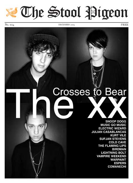
For the Artist's name i've used VTS chalk 79. I like this font as it is square but it has an artistic element to it. But like the previous font, it blends into the background around the artist's shirt. I think I could solve this by making this font a more greyish colour. This font does look better in colour against a white background. This is probably because you can partially see through it.
For the extra text on the cover page, I wanted to use a simple font. I've chosen to use the Champagne font, but it's very thin and again blends into the background.
I think I may have to re-think the use of white text on parts of the cover to make the text more readable and make the magazine 
title stand out more.


Audience Profile

The magazine I want to create will be aimed at Male and Female audiences between the ages of 16-30.

This is an example of the type of person my magazine will be aimed at: 

Age:  17 years old.

Gender:  Female 

Interests/Hobbies:  Plays guitar, studies art/design, photography, Films and TV,busy life - homework/friends, part-time job in supermarket, uses lots of social networks e.g. facebook and twitter. Plays regular gigs and open mic nights with other musicians.

Spends Money On: Gig tickets, Recording equipment, Art supplies, Books, Clothes and CD's/Vinyls

Occupation: Student 

Currently Studying: AS level - Art, Graphics, Media and Music


Future: Wants to go to uni to study product design, after wants to either become a Musician or something to do with art and design.

Music: Acoustic, Indie, Folk. e.g. Laura Marling, Ben Howard, Jake Bugg, Lucy Rose, Daughter, Bon Iver, The Lumineers, Willy Mason, Kate Nash, Bombay Bicycle Club. Some local musicians from local gigs and through friends.

Style: Skinny Jeans, Simple Tops, Converse or any flats, checkered tops, wooly jumpers.


Tuesday 29 January 2013

Magazine Construction Task


I chose an image of an artist of the genre I want to base my own magazine around (Ben Howard). For my magazine I also want to use an outdoor mid shot. I started with the name 'Frontline' in a 'Georgia' font as i felt that it suited the genre. I then added the date and barcode, I later realised that I had left the price off the cover, which I was thinking would be £3.00. I liked the idea of having a handwritten font as it looks more interesting, after choosing a font for the artists name, I felt that this did not match with the Georgia font I had chosen for the original title, so I decided to change the font to a more modern, attractive font. I then moved the date underneath the masthead as I believe that this looks better than if it was to the side. 

Mood Board - Animoto

Make your own slideshow with music at Animoto.

Monday 28 January 2013

Colour Scheme Ideas


These are the colour palettes I have looked at for my magazine. I think that the colour palette will depend a lot on what the picture of the artist will be, what clothes there wearing and what the background of the image will be. I think the Headline should be a bight colour which contrast the background. I think that the Subheading should compliment the headline yet still stand out. The article text should contrast with the background yet be readable, so I should not put colours like red and blue together as they are not very legible. Yellow on Black is the most legible colours together, yet I do not think that these colours would suit my magazines genre.

Fonts

For the headlines, I have chosen bold fonts with an artistic quality, as it would suit my magazine's genre and appeal to the target audience.
I think my favorite font is probably the calendar font. This stands out much more than the others, yet I am not sure that this suits the magazines genre as it is quite boring.
I think Bandgla and Gabriola stands out as well, they are bold and clear yet they aren't as square as calendar.
For Sub-Headings and the article's text, I think a basic, less artistic font would be easier and clearer to read.
I like typewriter fonts like Courier, yet I think texts like this may be more suitable for headlines and subheadings than an article as it could not be as readable as the other fonts I have looked at like News Gothic or Lucida.

Sunday 20 January 2013

Magazine Research: Double Page Spread

MOJO
The title of this article is spread across both pages in a bold font. This means that it is the first thing that the readers eye catches when turning to the page. The title fades from orange to white, these colours contrast the black and white background, this makes the font more legible. I think that the use of oranges is not as strong and bold as the use of reds. The image is spread across both pages and acts as the background for the article. Also the background is a brick wall, I think that this feature is very effective as it is not just plan white, and has a texture to it. The artist are on either sides of the article. I like the way that the artists are placed on either sides as it doesn't mean that one page of the double page spread is taken up, and the text can be more artistically placed.


THE FLY 
This article has no title, yet my eye is drawn to the quote in the middle of the article. This may be because it's bold and in the centre of a white page. I like the use of quote boxes, and I think that I will use these in my double page spread.
An image of the featured artist takes up the whole of the second page as tiled images of each member of the band. This may make it easier to fit each member of the band onto the double page spread without including an image that looks overcrowded. These photos have been edited to have a blue tone to them, this may have been to match the colour scheme on the article page. Also the use of toy cameras has become a recent trend and the blue tones could imitate what the use of these cameras can produce. Below the article there is a watermark of play/pause/search buttons, this is a decorative feature and does not need to be there, but I think that it helps the magazine to keep the music theme throughout the magazine and show which artist's are featured as this is on most feature articles in The Fly.


NME
I like the font used on the top quote of this double page because I think that it really stands out and suits the artist's personality and the quote itself. There is a introduction before the article, which summarises what the article covers and makes the reader want to carry on. Before the article the first letter is big and bold like most articles, I like this feature and I think i'll use it on my own double page spread. I like how the artist is styled in this feature as it reflects her own personality. I also like the use of a plain white background, but as I am thinking of making a magazine that is not of a similar genre, I want to use an outdoor shot. 


Magazine Research: Contents

THE FLY 
This content page features a large image of the artist, this may not be the featured artist on the cover, but helps to show the magazine's variety of music. The colour scheme is simple blue, black and white, I like the use of a black and white image as it as a simplistic look to the contents page. The date is in a pale blue overlapped by the image, also the pale blue is not very bold, but as the background is white it does. The font for the date is simple and bold, yet it is not as eye-catching as the image of the artists, this means that the first thing you see is a featured artist.
The page numbers are a bold font with a small description of what is on each page. These numbers are on a plain white background, this means they stand out clearly.
I like the simplicity of this contents page and the use of simple colours.
NME  
This contents page is from the Indie magazine NME. The title of the page is a bold, classic font against a white background.This makes the magazine seem more like a newspaper. Underneath the title there is an image of the featured story  with a description underneath. This is framed by 7 images of what else is in the magazine, including a box with other stories included in the magazine. These images are in colour, and the text is black, meaning the eye catches the images before it sees the text.
What I like about this contents page is that there is plenty of images on the page and its very colourful. 
SPIN
This magazine features many genres. What I like about this contents page is how the image stands out and how the artist is posing. 
To the left hand side of the artist the text shows what is featured in the magazine on different pages. The text is a clear, defined font. There is a blue box below this, which stands out and includes what is on the cover. This makes it easier for the reader to find an article that interested them on the front page.
The magazine's title 'Spin' is also on the contents page, it is white text in a red box. These colours contrast each other meaning the white will stand out more. There is a quote from the artist's interview in the top right corner, this may interest the reader and make them want to go on and read the interview of the artist.

Thursday 17 January 2013

Magazine Research

SPIN MAGAZINE
This magazine's title is relevant to magazines theme as 'Spin' refers to DJ's. 
The layout clearly shows the artist in the center of the cover, yet the title is slightly hidden. There is hand-written text filling up the background and this may attract the audience's eye.
The image shows a member of the popular band Kings of Leon who at the time were the 'band of the year'.
The majority of the text is handwritten, yet the SPIN title is not, this means it's clear and recognisable even if it's slightly hidden behind the artist. I think that the use of the handwritten font makes the magazine seem less formal also the font contrasts with the magazine's title.
The target audience of this magazine would be young adults that have an interest in music. Spin Magazine's featured artist come from a range genres. Mostly Rock, Indie and Rap.


ROLLING STONE
'Rolling Stone' is named after a song from the 1950's yet many readers probably don't know this, yet because Rolling Stone has a reputation readers will associate the title with music.
The layout has the masthead spread across the top of the page.  The image is a close up of the artist (Adele), meaning there is no background with titles down the left hand side of the cover.
The masthead font is an older style of fonts which contrasts with the bold, square fonts to show the feature articles.
The target audience of this magazine can range from young adults to middle-aged people who like mainstream music. 


THE FLY
A reader would not associate 'The Fly' with music, yet it could relate to the phrase 'Fly on the Wall'. 
The masthead is spread across the top of the cover with some of the featured artist above. The images are spread across the cover in a grid to spell out the bands name (Dananananaykroyd), with a phrase 'Meet Britain's craziest band!'.
The bands name is very long and the cover has been cleverly done to avoid having to cramp the title of the artist across the page without blocking the image of the band. 
The target audience of this magazine would be young adults that like Indie/Alternative music.


MORE COVERS:


Preliminary Magazine Work